Friday 7 October 2011

Blog 10: Postmodernism

Post-modernists and “remix” techniques is an era where designers are getting to be creative in different ways and “break all the rules” instead of taking one design style from the past many are remixed together to make something unique in its own way. I think this is important for the culture of society considering design is becoming more of what the designers want to do without the restrictions of having to abide by the certain style of the time.

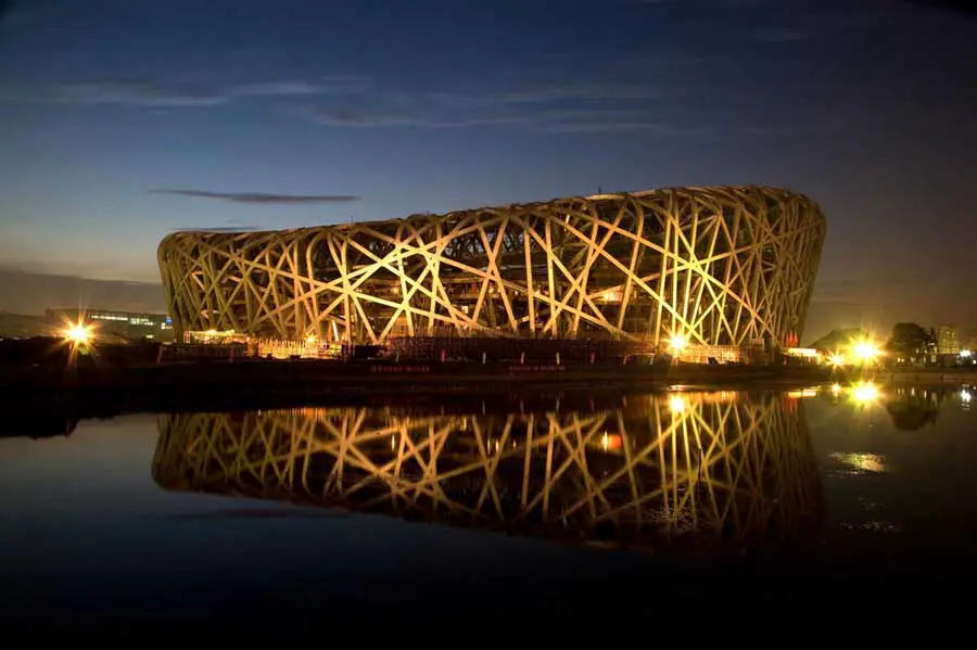
One example of post modernism I is the birds nest stadium in Beijing which was completed in 2008. The birds nest uses a variety of different styles in its design for example using scale as a main factor making something that looks like a birds nest but a lot bigger than what any birds nest could be. There is also the design method of stripping the object down to the raw materials where there is the metal with nor ornament in there with the lines being very straight and structured like but then the overall effect is very curvy so they have added many types of styles to this design.
These different elements of design in the making of the birds nest helps portray the culture in Beijing and showing what people living there are capable of.  


___________________________________________________________

Friday 30 September 2011

Blog assignment 9


In today’s society I believe that designers are being more and more influenced by ideological messages.  Ideologies have been used in history especially during the cold war in the 1940’s where there was a strong idea of how the living standard of the average person should be.

 One of the main influences I think is the “Green” or eco-friendly ideas where we are getting more concerned about our planet with global warming, pollution etc. that being more eco-friendly is being vastly promoted throughout design in consumer products. It’s all to do with how the consumer thinks and if you are promoting yourself as helping reduce pollution then when people buy your product they will feel as though they have done some good in helping the planet and that makes a product more appealing to most consumers. 

One example of this is a taxi service called Green cabs with the slogan “safer for you, safer for your environment” where their main advertising scheme is promoting that if you get their taxi with their eco-friendly cars you are helping the environment and part of the design of the taxis is that it is green with a globe on it so it is easy to distinguish.  Using ideas such as these adds value to the product and in the consumers eyes they are getting a taxi that offers low taxi fares and as well as the eco-friendly idea so the consumer is getting a wider range of benefits which will make it more appealing. I think the use of this idea is becoming more and more popular and as it is a serious issue the world is facing I believe more and more companies will start putting this idea into their designs. 

  ____________________________________________________________
Image sourced from:


Friday 23 September 2011

Blog assignment 8: Modernism

I believe that today design is a mixture art and science. They both need each other in order to have a balanced out design and without it the design would become focusing too much on how logic a design is. If only the science was put into consideration which can constrain and limit the abilities of a design. 

I disagree with Meyer’s view of ‘function x economy’ I think that as the times change so does our demand for our design. No longer are materials fairly expensive and hard to get a hold of. No longer are designs made to just do its function while using the least amount of material as possible and as cheap as possible. In today’s world that is not enough to just have the function due to the fact that there are more resources and materials that can be spared to use for the function of a design.  The design has to stand out to the consumer aesthetically to get their attention and add extra meaning to it otherwise even if it is true to its function it would not get a second glimpse with any aesthetics to it.  For example with The Palm Islands which is an artificial archipelago in Dubai which can be seen from space. This goes far beyond the point of the function of an island but it is because of this unique aesthetic to it, it is so famous where if it was just an island it would still provide the same function but would not be as renown. 

For a design to be successful I believe it must have the function (science) element in it as well as the aesthetic (art) side to it.

 ____________________________________________________________

Friday 16 September 2011

Blog assignment 7


The concept of a “symbolic universe” as a cultural structure of legitimation” is often apparent in low points of society such as the great depression and where world fairs were often made to express an idea of a brighter future where society was going to advance into a utopia. The main world fairs were held in the 1930s with the Century of progress exposition (CPE) which was held in Chicago in 1933-34 and the New Yorks world fair that was held in 1939-1940. In these fairs new technology were displayed to show a better world in the future and a way to improve living standards. 

Examples of a “symbolic universe” today is in a game called fallout which is set during the 22nd and 23rd centuries, its retro-futuristic story are influenced by the post-war culture of 1950s America, and its combination of hope for the promises of  a “better tomorrow” and a utopia. Here are close relevance of dire situations present in a society in the cold war where there is devastation (the great depression) and ideals of a near future world that is better than the one the society is in at the moment.


___________________________________________________________
Kihlstedt, F. (1986) Utopia realized: The world fairs of the 1930s.
Image sourced at: http://images.wikia.com/fallout/images/c/c0/Fallout_3_cover_art.png


Saturday 10 September 2011

Modern Vision.


Benjamin argues, “To an ever greater degree the work of art reproduced becomes the work of art designed for reproducibility. From a photographic negative, for example, one can make any number of prints; to ask for the authentic print makes no sense.” With saying this he is getting his point of view across of how technology is changing and at that point of time one of the big changes is the ability to more easily reproduce work so accurately compared to the past that we don’t need the original.

I agree with this and that because of the new technology we have and especially with digital media to have the original other than the point of being reproduced is irrelevant, for example if someone makes a poster or some digital media on the internet and it is widely produced where you have the original or copy of it in the end you are getting the same image and if there is no difference about it to the point where it would be even impossible to know which one was the original then there is nothing to gain from having the original. This also has an impact of the aura of the original where now days you would show someone your copies of your work and then the originals on a screen and it would not be anywhere near as impressive and special as something like the paintings describing moments in history such as the Oath of the Horatii, 1784 by Jacques Louis David.


Thursday 11 August 2011

Blog assgignment 5.

 
How has the experience and experimentation of artists influenced our understanding of colour and the development of a theory of ‘colour vision’?

The experience and experimentation in which artists have developed our understanding of “colour vision” has been made firstly of Isaac Newton’s understanding of colour which was looking at colour in a very scientific way which led to Newton’s colour wheel. This was the first big change in how artists saw colour up until Johann Wolfgang von Goethe criticized Newton’s theory on colour as he thought that he trusted math instead of the sensation of the eye.   Michel Eugene Cherreul, had a theory of simultaneous contrast, where colour is related more to the way we perceive it; He explained it as “two adjacent colours when seen by the eye will appear as dissimilar as possible.”  These were two different views on how colour comes together where Newton’s view was a more straight forward mathematical view and Cherreul’s view was a more abstract view on what we perceive. Another person who experimented with colour and changed the way we perceive it was Johann Wolfgang von Goethe, he experimented with light and dark areas in a prism to look at the colour changes which occurred when the edge of the colours changed. He came to the conclusion from this research that colour was only able to be seen once it was disturbed by colour.

I think that Newton had the best view because he was the first person to make the colour wheel and have more straightforward mathematical view on the way in which colour is formed. Because of  artists and scientists investigating the way people perceived colour the way artist considered colour was changed. Without these investigations I belive that art would not be quite the same as it is today.


Reference


Gage, J. (1993). Colours of the Mind in Colour and Culture: Practice and Meaning from Antiquity to Abstraction (pp.191-212). New York: Thames and Hudson. 

Thursday 4 August 2011

Blog 4: Ornament or nature.


Adolf Loos argued in 1908 that, “The evolution of culture is synonymous with the removal of ornament from objects of daily use.” He is referring to his argument that as society evolves so does our urge to use ornament with our designs and we cannot continue to use ornament as it, “can no longer be borne by someone who exists at our level of culture.” That at his era of time the not only is ornaments made by criminals but it is a crime in its self because of what it does to the economy. Also that ornament is causing problems with labor because workers get paid low wages due to having to work longer to get something with ornament made than something without.

 I agree with some parts of his argument as I think that It is a waste of materials and time of workers to make them work longer just for something to have added aesthetics to it while nothing to do with the product is improved and even in some cases hindered. I believe that to a certain extent the main focus should be only on the materials and how well it works because then it just turns into something that’s purpose is reduced to merely the use of looking at it.

One point that Loos argued that I do not agree with however is that “as ornament is no longer organically related to our culture, it is also no longer the expression of our culture.” He is stating that it is a thing of the past ornaments to be used in the modern culture while things should be stripped back to the basic raw form of the object. However I think that as culture evolves there should be no set rule on whether or not there should be ornaments on designs as with the development with “culture” it should be up to the designers of the time to decide how they make their creations aesthetic. For example with this gaming controller decoration, it is an ornament being used that signifies the culture of our modern time.


http://technabob.com/blog/wp-content/uploads/2009/11/video_game_controller_ornaments_2.jpg

Thursday 28 July 2011

blog assignment 3.


What Owen Jones means by “Construction should be decorated. Decoration should never be purposely constructed.” Is that If you have an object you should decorate it in order to make the object look more aesthetic but not to the point where the it comprehends the use of the object due to the main purpose being how it looks rather than it working as it should do. This is supported in Raizam’s “Design, Society, Standards” where Owen Jones says that objects should only be used to “convey the intended image to the mind, without destroying the unity of the object they are employed to decorate” This was said as more and more designs were starting to be made that had mostly the aesthetics in mind when making it but in the end result was not doing the job it was meant for properly.

I agree with Jones on his quote and in my opinion I like constructions to be aesthetic but not at the expense of the usability. I like when constructions have subtle details to it to make it look aesthetic but it is still obvious of what the construction is. For example the iphone 4 how you know it’s a phone but they have changed the materials from most phones and used glass and a stainless steel band around the outside instead of plastic like most phones. They made this construction really nice to look at and at the same time it serves its purpose as a phone. 


Thursday 21 July 2011

project two. The Continuing Curve


I think that “The Safe House,” designed by KWK Promes is an example of “the continuing curve” as it has very “male” like aspects of the design for example this design is logical, mathematical. The design of this house seems like a whole bundle of squares. I do believe it is a result of the “sensuous impulse” because it looks like this house was design for its purpose (a zombie proof safe house) but it also looks very appealing and modern on the inside as well so it does affect the way that objects are designed so they are still aesthetic but at the same time they are providing the functions that the object is suppose to do.